The End Is Nigh

by Janis Patterson

For every beginning there is an ending… and conversely, for every ending there is a beginning… and sometimes it’s hard to tell the difference.


This year has been a landmark year for me – it’s been one of the lowest output years for me in well over a decade (only two books as opposed to the four or five I usually do) and yet I’ve been busier than I ever have.
In case you have been living under a rock and not heard about my republishing blitz I’m going to give you a quick précis…


During the covid crazies I got very lazy. The Husband was home – and even retired during this time – s0 we had things to do and my writing business came in a distant second to being with him. I knew that rights on previously published books were coming back to me, but being distracted by other things I just let the reversion letters pile up on my computer.


Until January of this year. Life was returning to a semblance of normal and I realized I wasn’t getting any younger (are any of us?) and if I wanted to get back into this writing thing I had to get busy, so a good start would be republishing those reverted books through my own company. A quick wander through my hard drive shocked me, because there were 26 (yes, TWENTY SIX) of the little beasties. Gulp.


A quick perusal decided me that for various reasons four of them were going permanently ‘under the bed,’ hopefully never to be seen again. That left 22 to be republished. As I am lazy, doing that could possibly take a couple of years, years which I might not have. As I was raised in advertising and journalism, the fact that deadlines are sacred is bred into my blood and bones. My father taught me that (to use his words) “There is only one excuse for you to miss a deadline, and that is death. Yours.”


So I set myself a deadline – I would release a book freshly edited, freshly formatted and most with new covers every other Wednesday until all were out, starting on January 15. MISTLETOE MAGIC, the last book, comes out October 25.
22 books released every other Wednesday, each on schedule, each reworked as promised and all without missing a single release day. (Actually, there were 24 released – one through one of my publishers and the other as an outlier which appeared suddenly through a set of circumstances too complex to go in to… neither of which I counted as part of the blitz.)


I’m exhausted. I would love to take a few weeks off away from the computer, but I have deadlines… one for a July 4th mystery anthology, one for my new Flora Melkiot book and one for a summer Regency romance anthology. Sigh. Even though we spend our days pretty much in the same room (the den) The Husband says I spend more time with the computer and my invisible friends than with him and lately he’s been right. I’ve taken my computer along on every trip we’ve made this year – and it saved my sometimes tenuous sanity the days we were holed up in a motel in Mississippi when he fell ill on our way home from NINC!


Anyway, the blitz is now over and the encroaching deadlines await. It doesn’t get any easier, people. It really doesn’t.

And now for some good news! EXERCISE IS MURDER is now available in audio from Audible! (The ebook is available from Amazon and will hopefully be available in paperback before too long… it is the first appearance of the redoubtable Flora Melkiot!)

Revamping My Covers by Heather Haven

I never realized that a book cover was a lot like a hairdo. They need to be updated every now and then. Frankly, I love my covers, especially for the Alvarez Family Murder Mysteries. They’re familiar. They’re comfortable. Whoops! Maybe when you start saying stuff like that it’s time for a redo. Sigh.

Let’s face it. A good, eye-catching cover is what helps sell a book, big time. Times change. What worked in the early 2000s may not work now. So here I am, deciding what I should do. Should I continue to do the covers myself or should I job them out? Has competition gotten so keen, I need to have a real professional do them for me? Although, I thought I was a professional. But am I a real, dyed-in-the-wool professional CA who can compete in today’s market? Okay. So there I got me. I’m not.

What I am is a professional writer who has enough on her plate and needs to job certain things out. Like my covers. Truth be told, I really would like more time for writing. For playing with my cat. For having lunch with my friends. For canoodling with my husband.

So, for the moment, The Alvarez Family Murder Mysteries covers are having a do-over. And not by me.

Amber Foxx on Image and Brand

I hate having my picture taken. Head shot, that is. I’m happy to pose for yoga pics. I feel normal in a yoga pose. Especially if I don’t have to look at the photographer. I feel really unnatural smiling at a camera, and it shows. I get such strange facial expressions, I hope I never actually look like that. I told my hairdresser about this while I was getting a haircut after the head shot session (I read that one should never get a new haircut before a picture session), and she said, “I know. Whenever I have my picture taken, I look like a drunken chipmunk. People ask me, what does a drunken chipmunk look like? I tell them: my picture.”

Now that I think of it, that’s what most of my pictures look like too. Torn between hiding from the camera and trying to convince my face to smile, I end up with one eye closed and the other wide open, and my smile half-cocked. I like the hiding-in-a-cherry tree picture I’ve use on this blog for years. Half my face is in the flowers. We started out using mysterious pictures, but gradually new bloggers joined and the remaining founding members updated their pics. Much as I like Kwanzan double-blossom cherry trees, that picture—though it expresses my personality—may not fit my image and brand.  But what does? If I’m posing for a yoga shot, I should look like someone you’d want to take a yoga class with. How do I look like someone whose book you want to read?

My series covers are designed to appeal to both visionary fiction and mystery readers, and their image and brand is closer to the visionary fiction genre. That’s intentional. The cover has to convey the mystical aspect of the mystery and the characters’ inner journeys. If my covers looked like cozies or like traditional murder mysteries, I’d be off target. Does hiding in a cherry tree make me look as if I write cozies? Many of my readers also enjoy cozies, but that’s not my genre.

I’ll spare you all the noise that ran through my head while planning for the head shot and keep to two main decisions. One: Maturity is a desirable characteristic in a writer, so I didn’t try to look younger. Two: I dressed the role of myself, if that makes sense, by wearing a turquoise necklace with citrine points made by a local artist. Because that’s my brand. New Mexico. Mystical. Crystals and healing and psychic visions. Is anyone going to analyze all that? I doubt it. But it’s like the right yoga pose for the yoga poster. Readers don’t expect authors to look like fashion models, but they may infer a lot from a picture without consciously thinking about it.

And I hope it’s not “That chipmunk had a few too many!”

*****

Book One in the Mae Martin Psychic Mystery Series, The Calling,  is free on all e-book retailers through Sept.23.


Judging a book …

Hey, y’all.

What’s new with you? Hope everything is good down your way. Read any good books lately? (Here’s a cyber cookie if you said you’d read mine and you thought they were “good”. I appreciate it, yo!)

If you didn’t say mine (not cool, bro) then how did you choose the book? Was it recommended to you by a friend? (I used to know a guy #douche who would get really offended when I didn’t rush out and buy whatever book he recommended. Like, sulk-for-a-whole-day offended. He used to think he had the best taste in books so he could never accept why I didn’t read what he suggested. I did mention he was a douche, right?)

Anyway, to get back on topic, how did you find your latest book? Recommendation from a non-douchey friend? Email from a promotions company? Did the cover catch your eye while you were browsing the digital Amazon/iBooks/Nook/Kobo shelves?


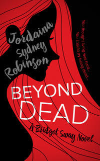
Beyond Dead
Old Bridget Sway cover

I ask because I recently changed all of my book covers. #nightmare Well, it’s wasn’t really a #nightmare as such but it was a LOT of work. Originally I hired a professional cover designer to do them, and I was super pleased with the result. I loved the cover for the first Bridget Sway book. It had been my idea (I wanted her hair to take up the cover and for you to not be able to see her face) and the designer ran with it. I remember I was ridiculously pleased with it at the time. It was my first ever cover! And then I got the second one done. And the third. And the fourth. And the shine completely wore off. 


The colour scheme was a bit limiting. (Straight up, I’m not really a black/red/grey/white type of girl. I do like those colours … but I’m more of a rainbow person.) And I was a bit fed up with how her face just moved around the cover. And I can’t tell you how many people asked me if they were horror books.


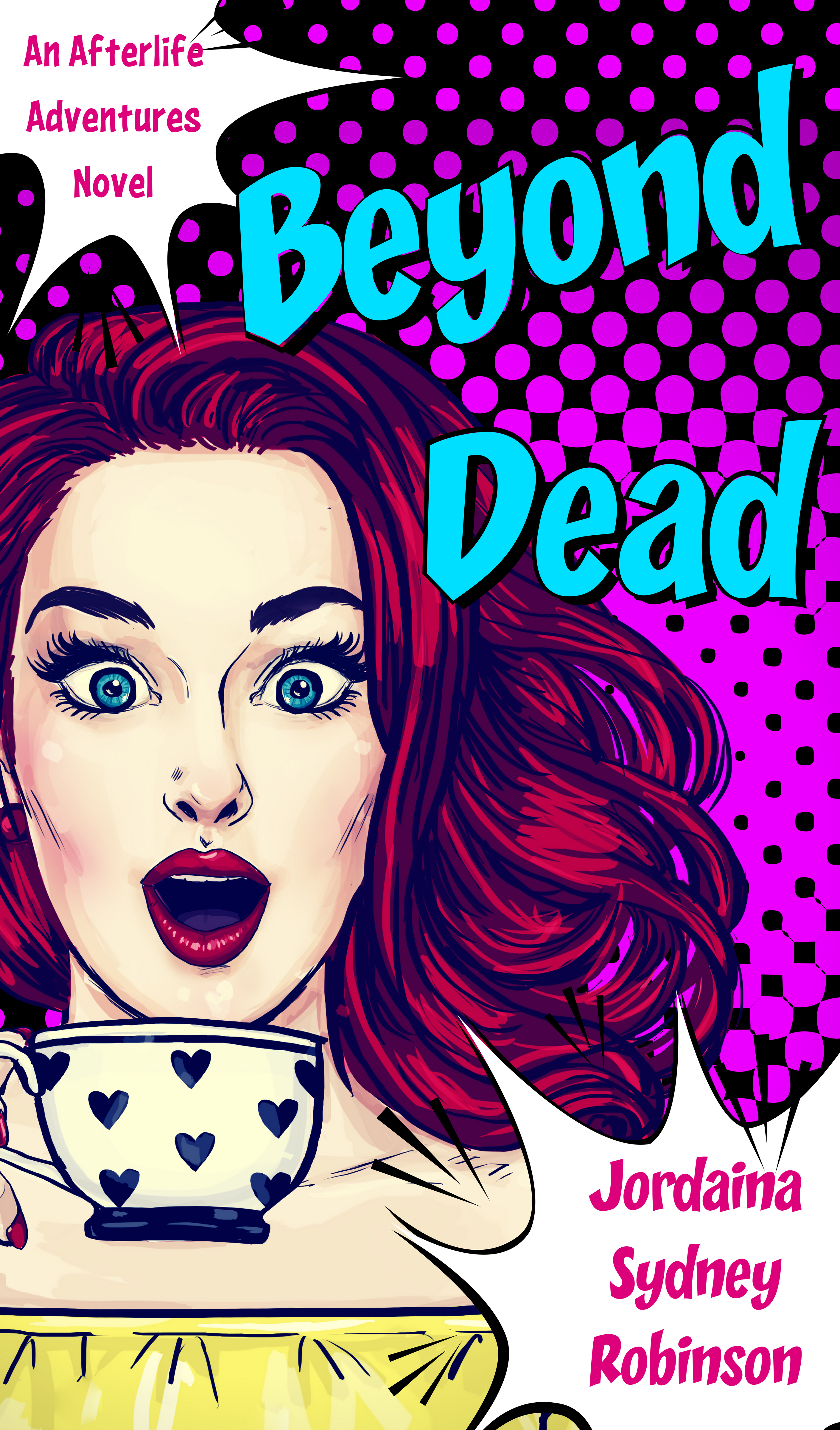
Beyond Dead - FINAL COVER-2
New Bridget Sway cover

So, I redid them. Yes, I did them myself. I didn’t know how much you know about that, but that is a huge no-no for independently published authors. It’s like an unspoken rule. But I did. And I LOVE them. I LOVE them so much. To me, the really express the tone of the stories the way the other covers didn’t. But you might not like the newer version, and that’s okay. Different strokes for different folks, yo. 


The biggest thing I took away from this is that you have to trust your gut when making these decisions. You have to trust your own instincts. Writing is a business, but it’s a personal one. It doesn’t matter whether it’s your covers or a comment that your editor makes. You have to trust that you have a story to tell and only you can tell it your way. 


Now, I believe you were about to tell me how awesome my covers were! Yeah, thought so!


Until next time …

Jordaina